iOS Product Recommender
Boost revenue per visitor by delivering personalised product recommendations in the shopping bag. Based on successful A/B testing, this feature is projected to generate an additional $8.2M in annual revenue.
Role
Product Design Lead
Date
Date: 2025
Company Overview
American Eagle Outfitters is a global retailer with $5.34 billion annual revenue. The mobile app contributes to over 40% of total digital sales.
Business Problem:
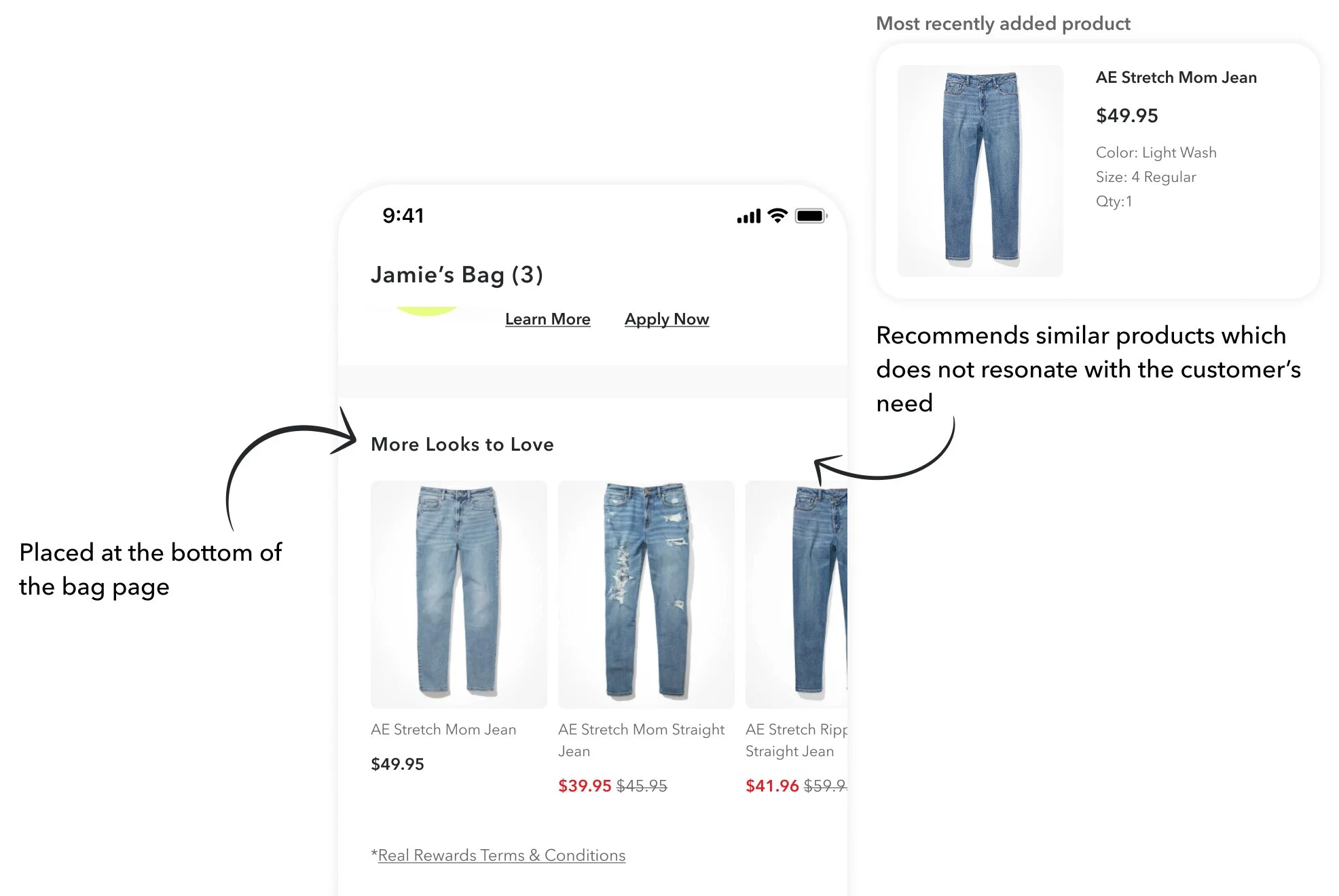
Our existing recommendation engine is overly simplistic and low on the page, leading to low engagement during the 13-second window users spend in the bag tab.
Competitive Analysis
I surveyed 20 specialty retailers similar to American Eagle + Aerie.
Takeaway #1:
Adoption Rates - 65% (13/20) of surveyed apps utilise product recommenders
30% (6/20) of apps have 1 recommender.
25% (5/20) have multiple recommenders.
10% (2/20) have an endless scroll for recommended products
Apps without recommenders typically favour a minimalist design.
Takeaway #2:
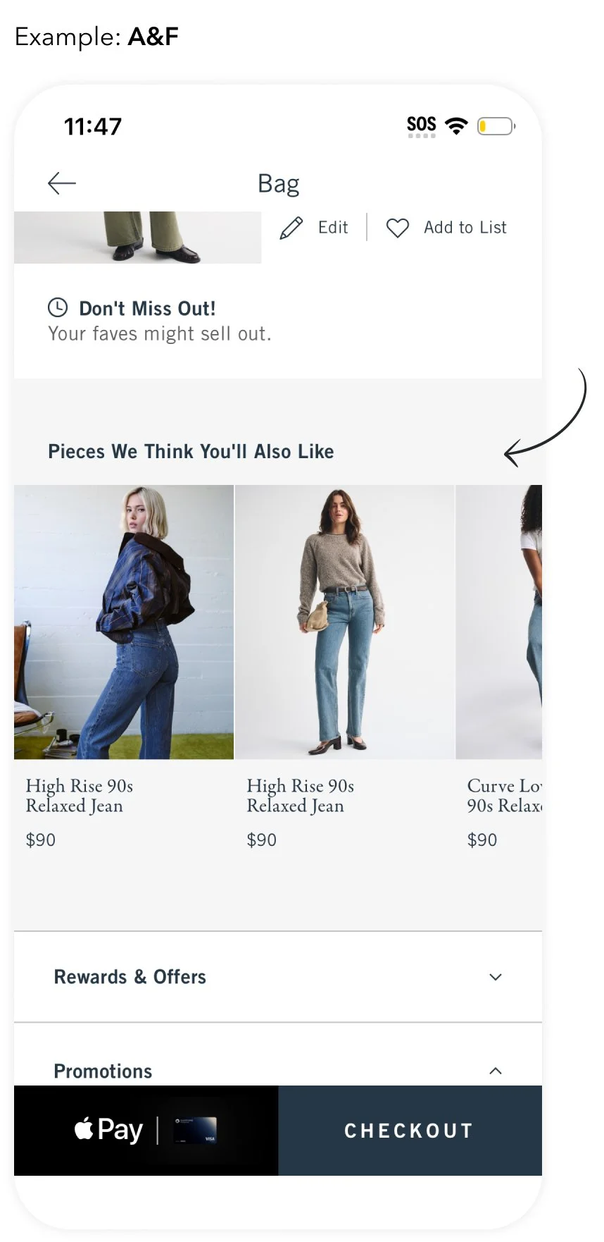
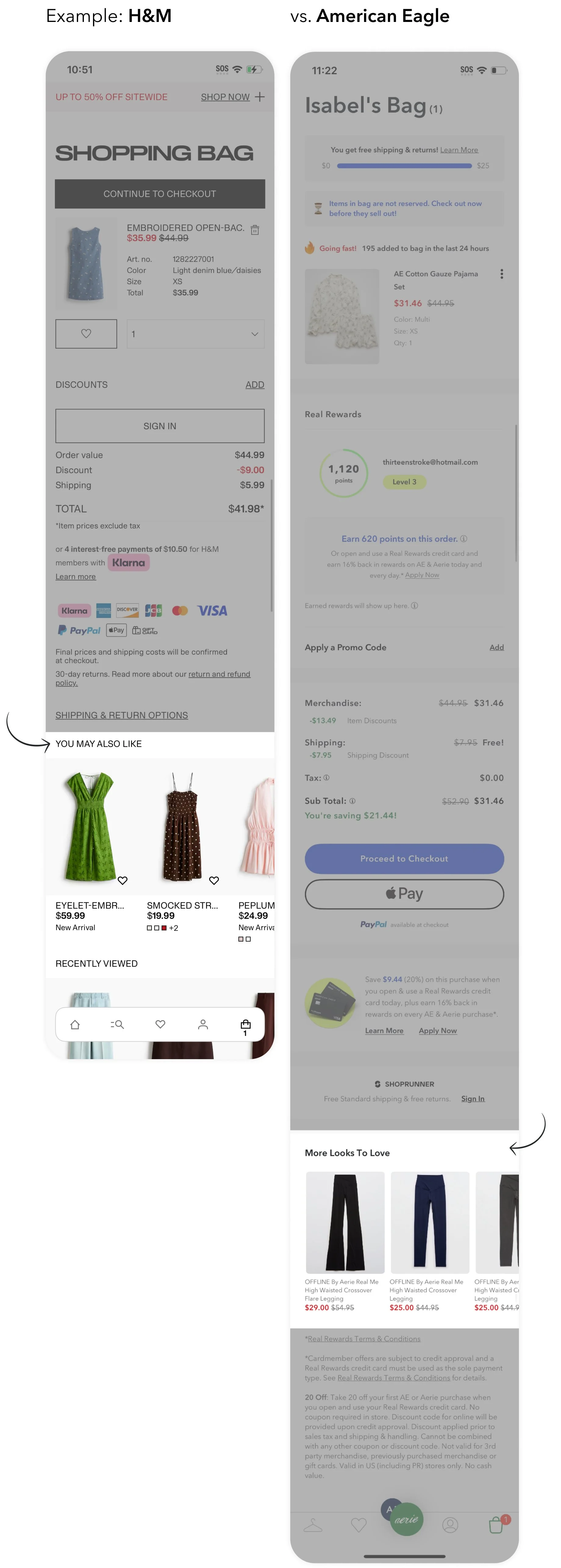
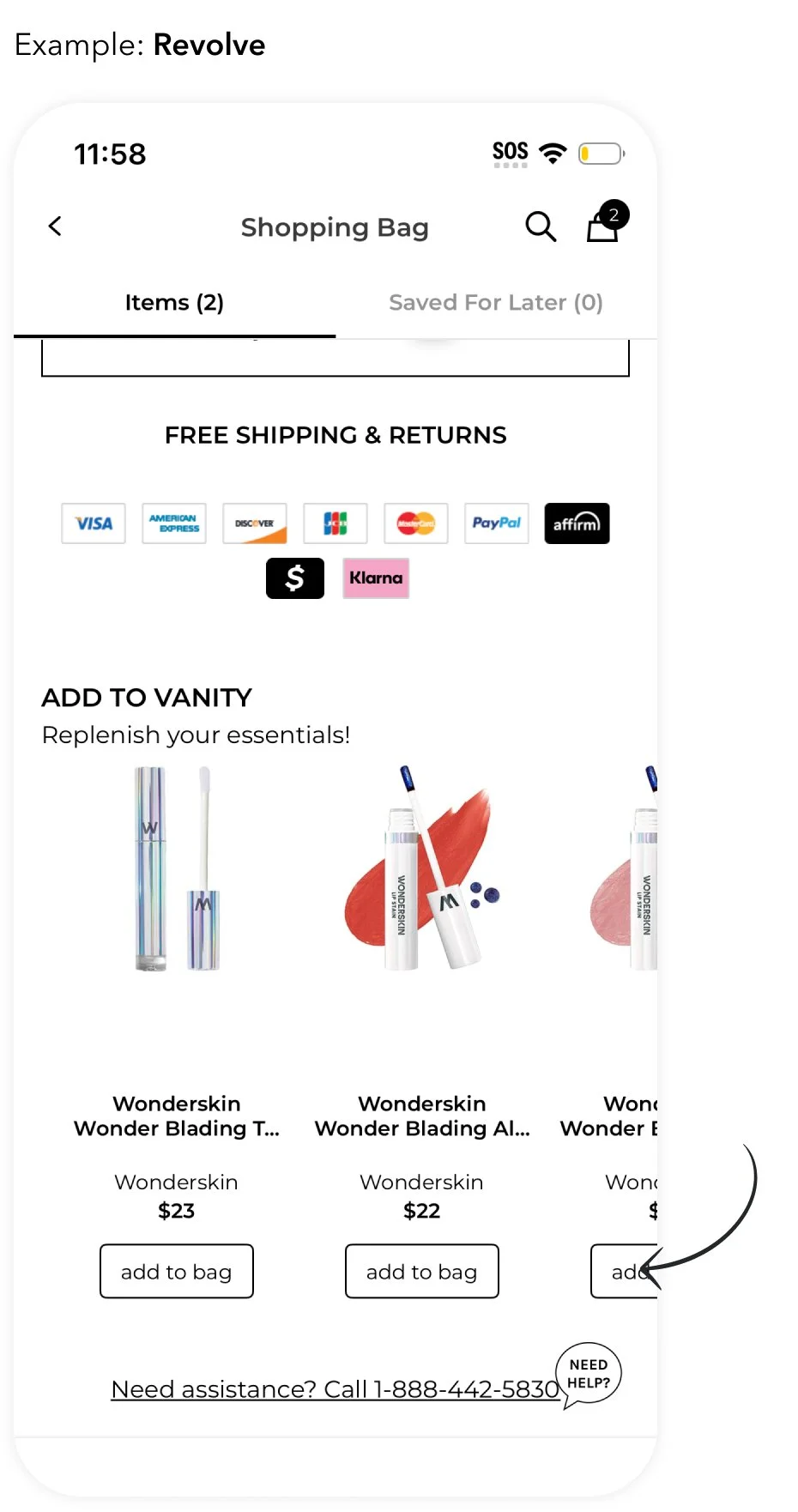
Placement - 62% (8/13) place their recommender at the bottom of the page
Notably, because our bag page is longer than the industry average, our "bottom of the page" requires more scrolling and is less visible than competitors'
Takeaway #3:
Conversion feature - 54% (7/13) has a direct "Add to Bag" call-to-action (CTA) within the recommender.
This is most common for simple products that do not require size selection or complex configurations.
Thought Starters:
Reduce Friction: How might we enable customers to add items to their order without leaving the Bag page?
Personalisation: How might we use customer behavioural insights to drive higher Revenue Per Visitor (RPV)?
Gamification & Delight: How might we transform the "Add to Bag" experience into a more interactive and engaging moment?
Design Brainstorms
I identified location and interaction as my primary design challenges. Rather than settling for a standard 'off-the-shelf' recommender, I chose to challenge the status quo and test whether a more bespoke, interactive design could drive higher engagement than traditional industry implementations.
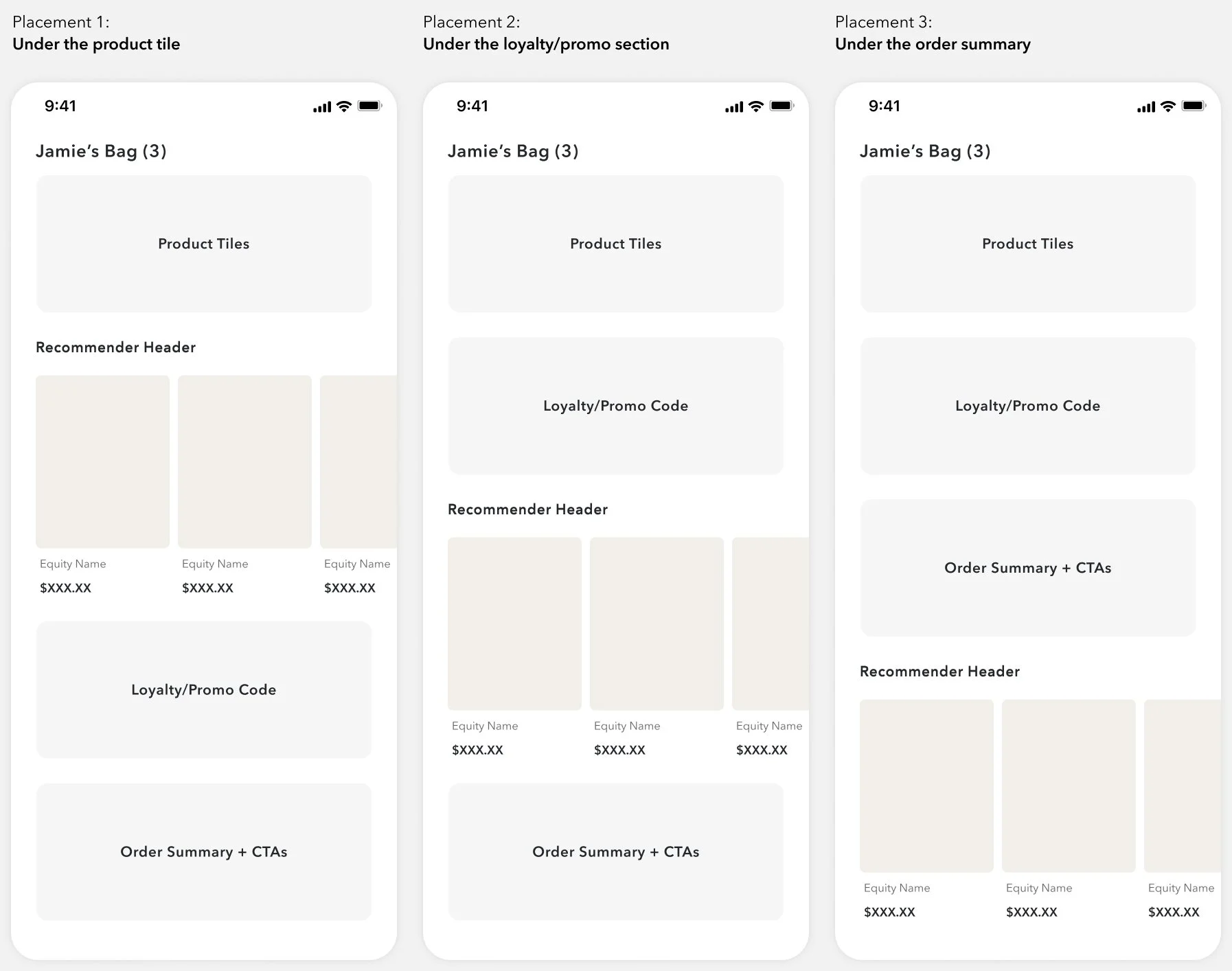
Placement Options (Where)
Each placement has its pros and cons, and the key is to increase visibility without cluttering the existing page.
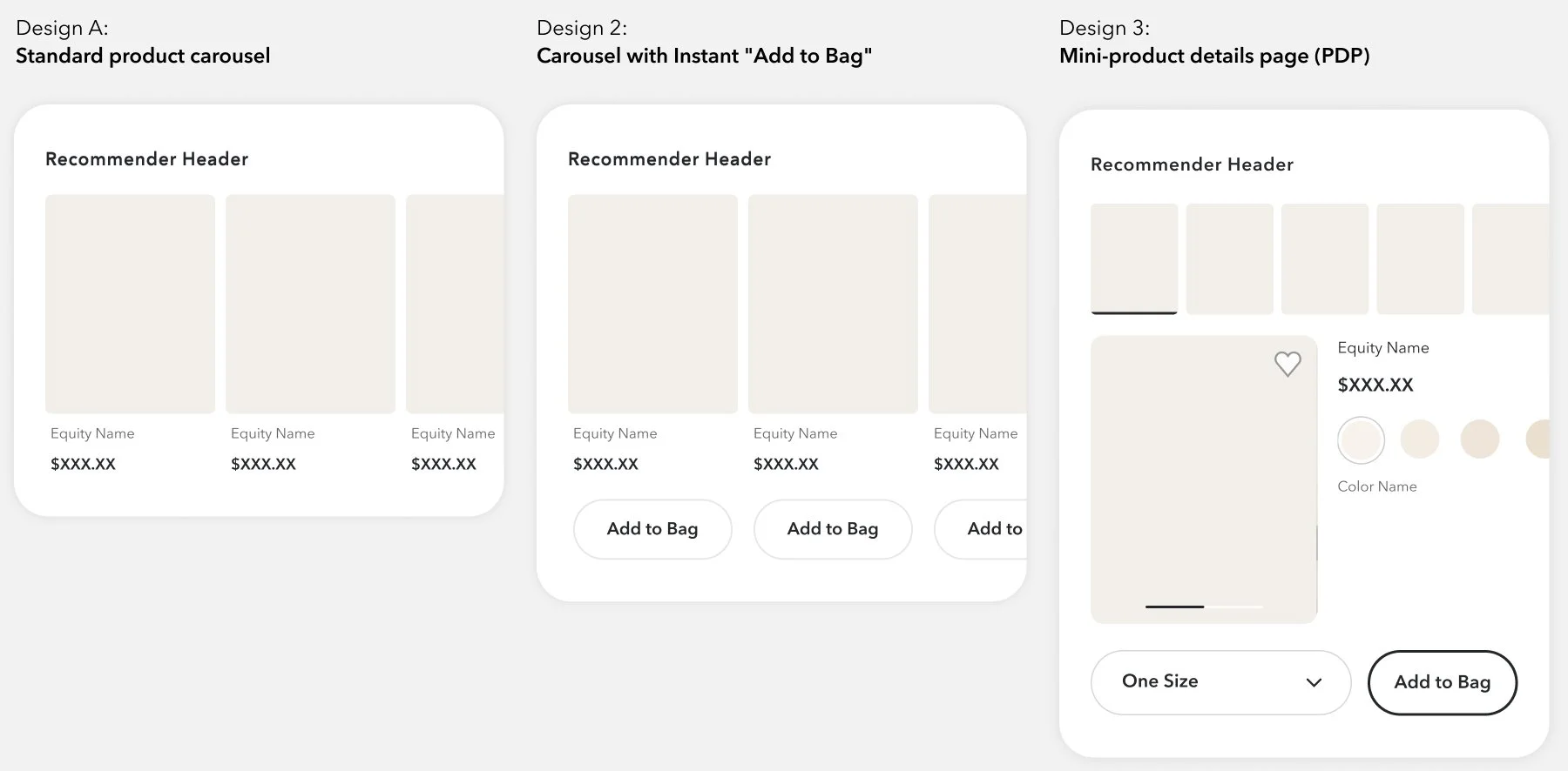
Design Configurations (How)
Without determining the recommender algorithm, it is hard to know how much details the customer would need to convert.
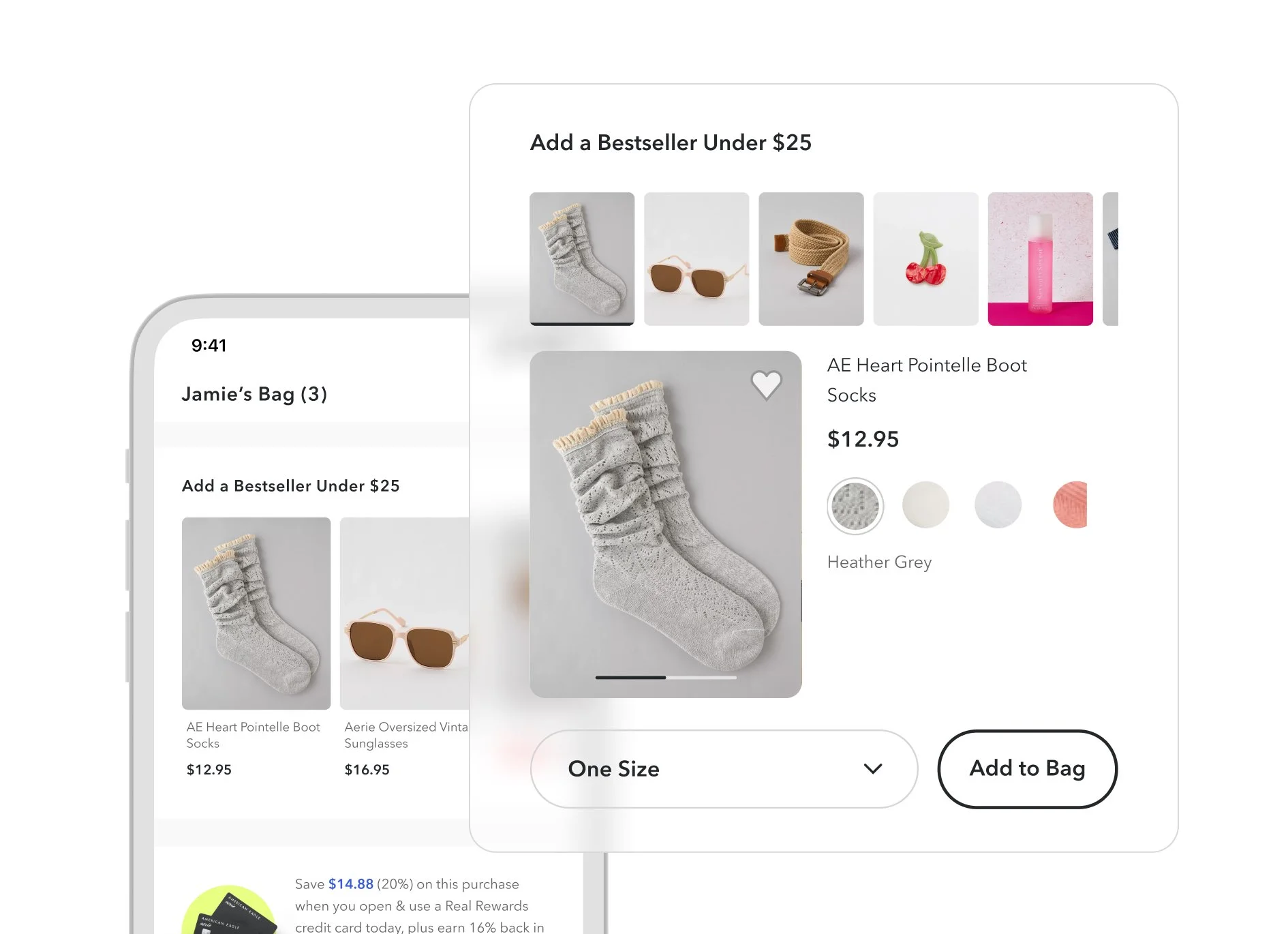
The Chosen Algorithm:
Best-Selling Accessories (<$25)
After a conversation with our personalisation algorithm vendor, we decided to test best-selling accessories triggered by the product the user most recently added.
Why this category?
No Sizing Issues: Every product is a "single size," reducing decision fatigue.
Low Friction: products are simple and don’t need too many details.
AOV Boost: Perfectly priced to help customers bridge the gap to free shipping.
Testing Strategy:
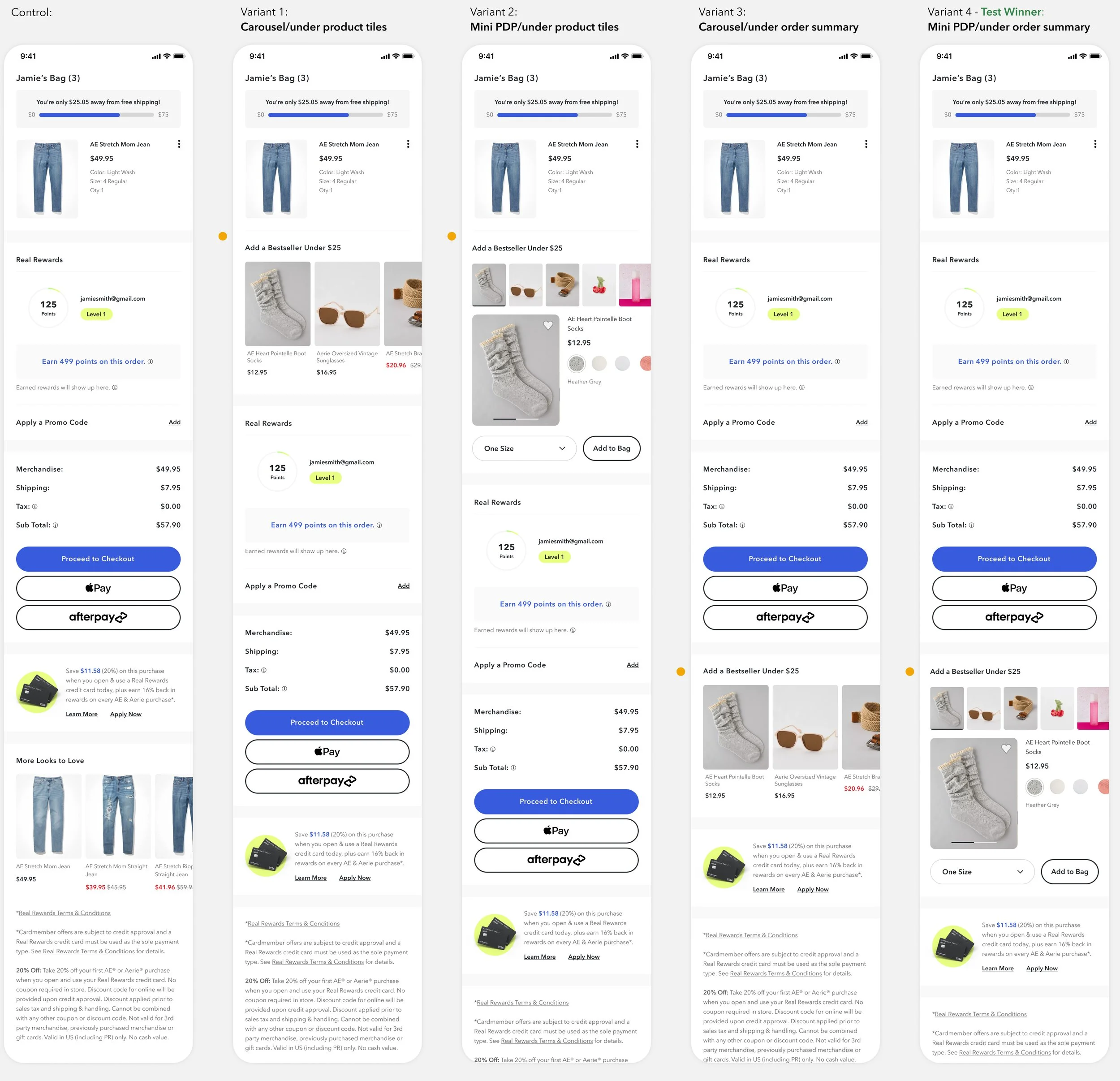
4-Variant Multivariate Test
We leveraged high bag-tab traffic to test a 2x2 matrix of design vs. placement:
The Winner: While the team initially doubted variant 4’s lower placement and complex design, it outperformed all other versions. By "pushing the envelope" on interaction design while respecting the user's primary goal (checkout), we provided the right amount of information at the right moment.
What did I learn?
Challenge the "Obvious" Winner. While the team was skeptical of a lower placement and complex UI, testing proved that "pushing the envelope" of the interaction design can outperform simpler industry standards.
What’s next?
Monitor the relationship between the total cart value and recommender engagement. Specifically, evaluate whether users are adding suggested items to meet the free shipping thresholds or if the recommendations themselves are inherently compelling.