iOS Bottom Navigation Optimisation
Optimise bottom navigation for better usability and scalable content testing. This A/B test winner is projected to drive +$4.21M in annual revenue.
Role
Product Design lead
Date
Date: 2025 - 2026
Company Overview
American Eagle Outfitters is a global retailer with $5.34 billion annual revenue. The mobile app contributes to over 40% of total digital sales.
Business Problem:
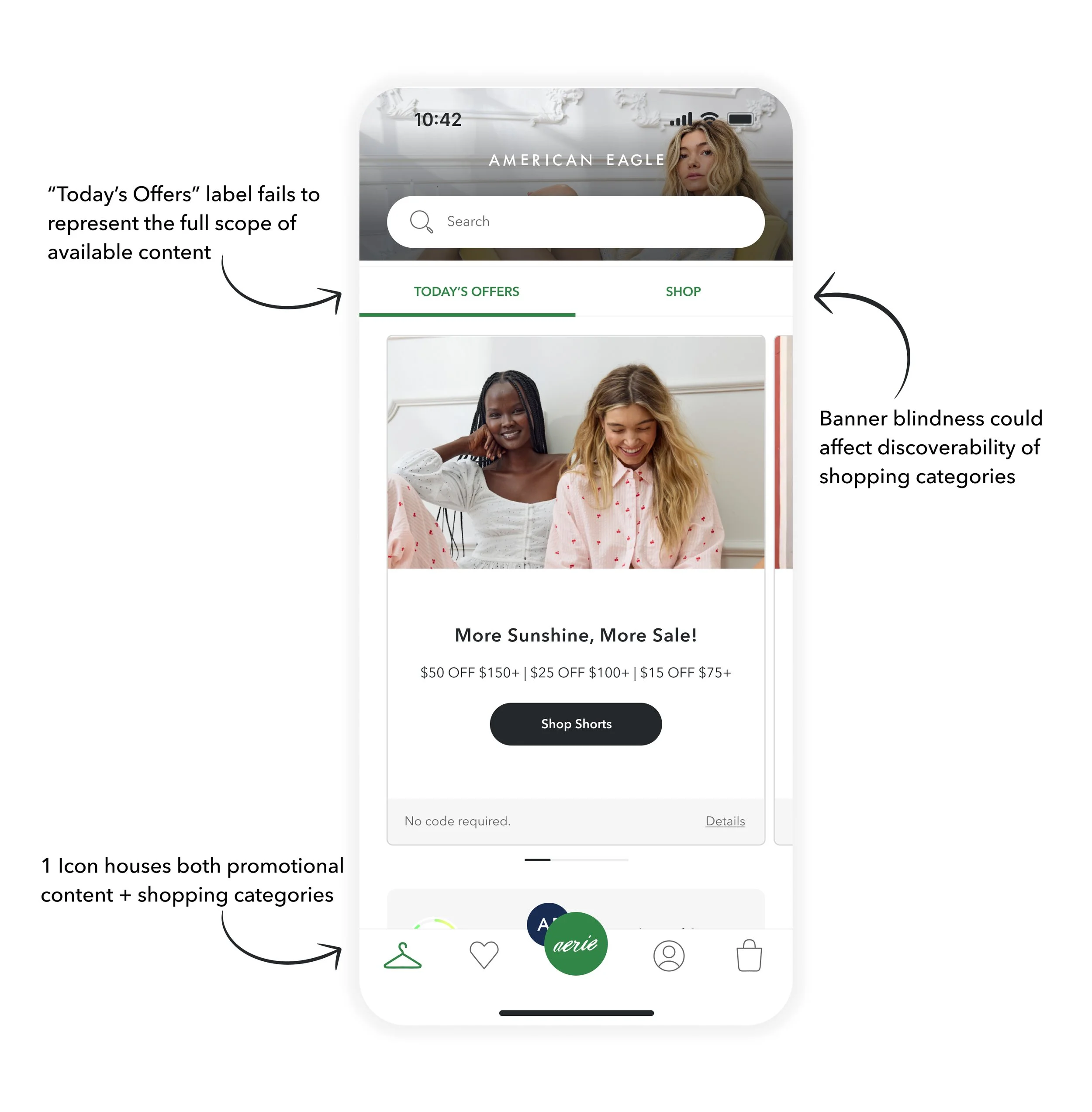
Currently, promotional content and shopping categories are nested under an ambiguous "hanger" icon. This creates a friction point for promotional content: the “Today’s Offers” label fails to represent the full scope of available content. As a result, users expecting to see only discounts drop off early, leading to low scroll depth and poor engagement with broader marketing initiatives.
Competitive Analysis
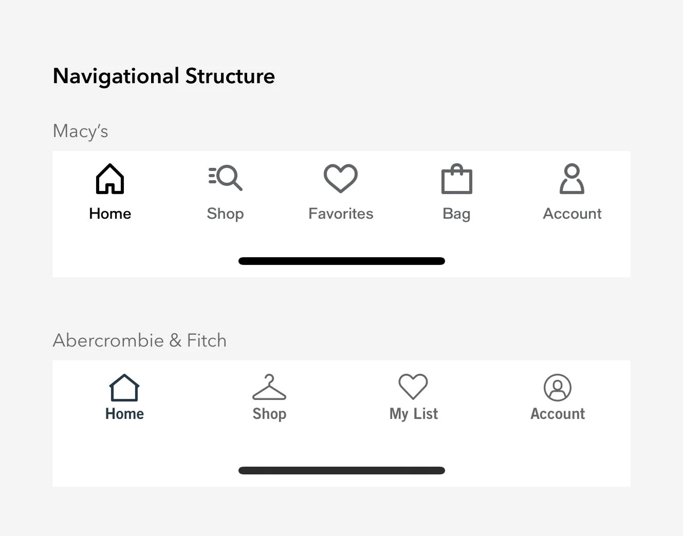
How does our navigation structure compare with 23 other specialty retailer apps?
Takeaway #1:
91% (21/23) have separate “Home” and “Shop” tabs in the bottom navigation bar.
Takeaway #2:
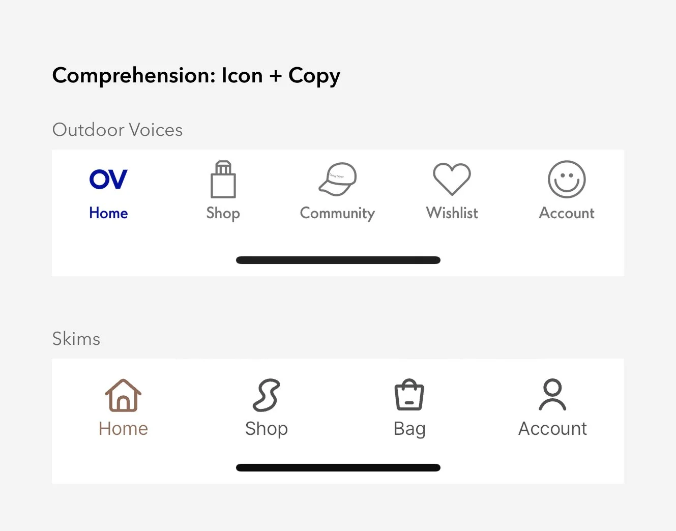
82% (19/23) use icon + copy.
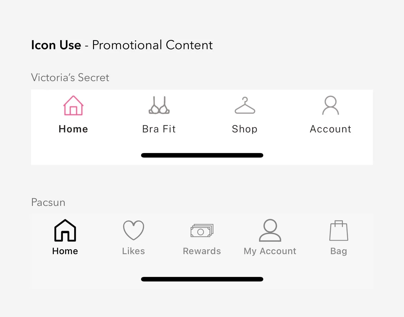
Takeaway #3:
For promotional content, 52% (12/23) use a house icon.
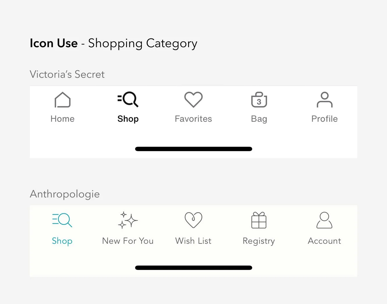
Takeaway #4:
For category shopping, 43% (10/23) use an hourglass and menu combined icon.
I recommended testing the navigation structure alongside copy and icon variants. This multi-variable approach will help us identify which specific elements drive the best performance.
Unique Considerations:
While we must validate if a standard layout works for our specific needs, we face two primary constraints:
Multi-Brand Architecture: The app currently supports American Eagle and Aerie, with plans to expand to additional brands in the future.
Real Estate Limitations: A standard 5-slot bottom nav becomes highly restrictive if one slot is permanently reserved for brand switching, leaving only four slots for primary navigation.
Phased Testing and Execution:
Given the development effort required, I recommended a multi-phased testing approach. By breaking the rollout into multiple tests, we can minimise UX risks and gain specific learnings at every step of the transition.
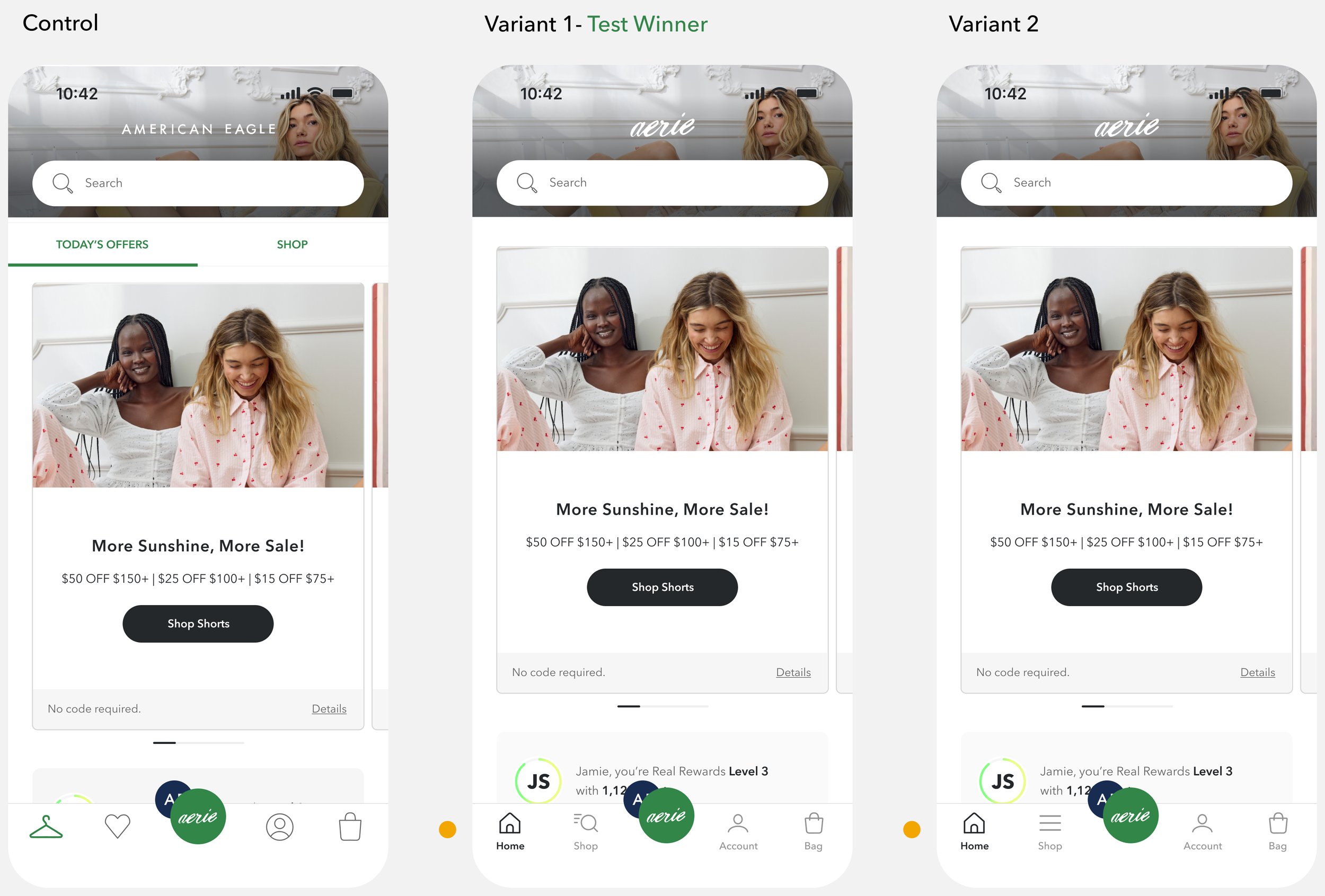
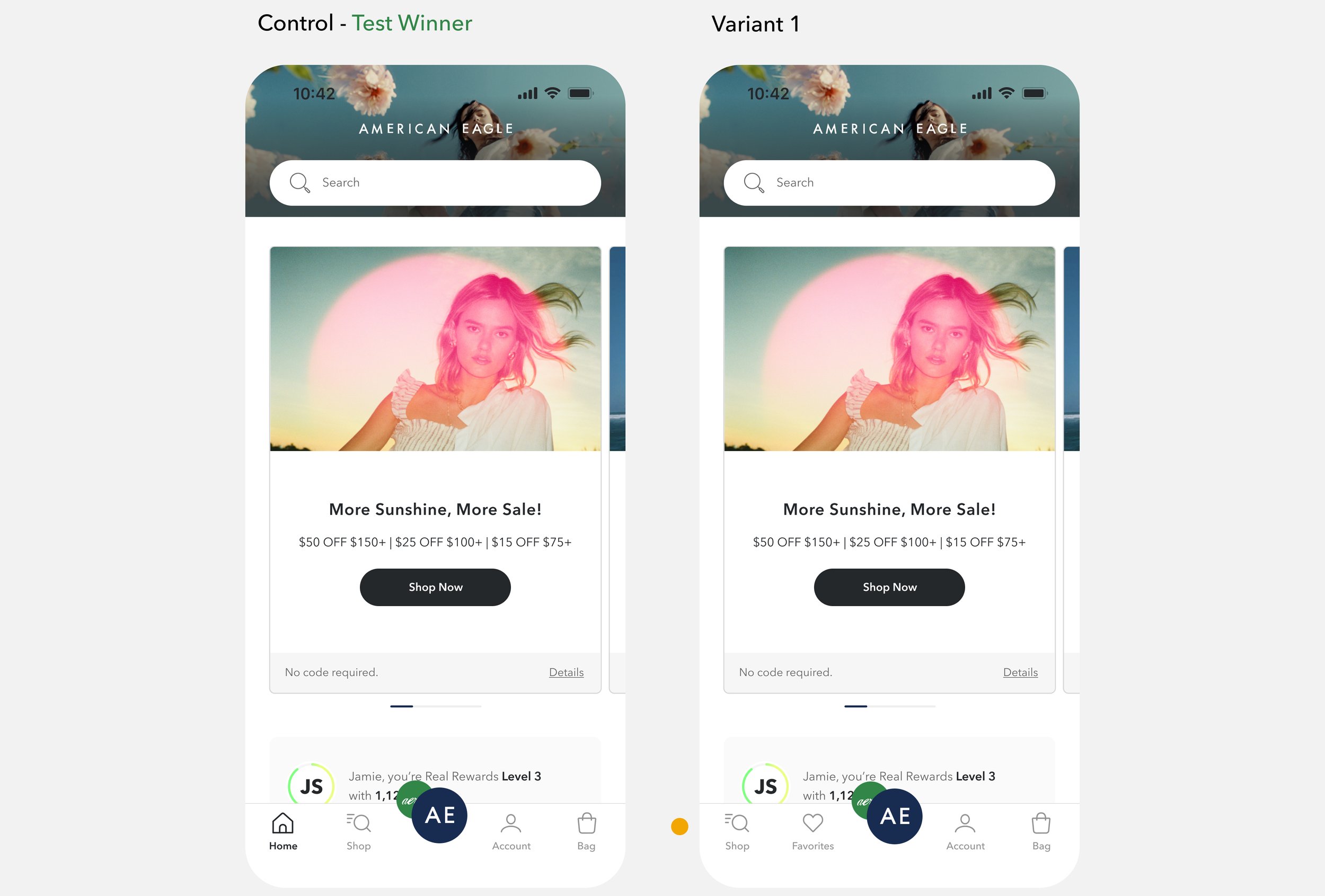
Test 1: 2025
Navigational Baseline & Usability Validation
Objective: Determine if restructuring the bottom navigation improves user flow without negatively impacting core usability.
Primary Metrics: Conversion rate, revenue, and favourites engagement.
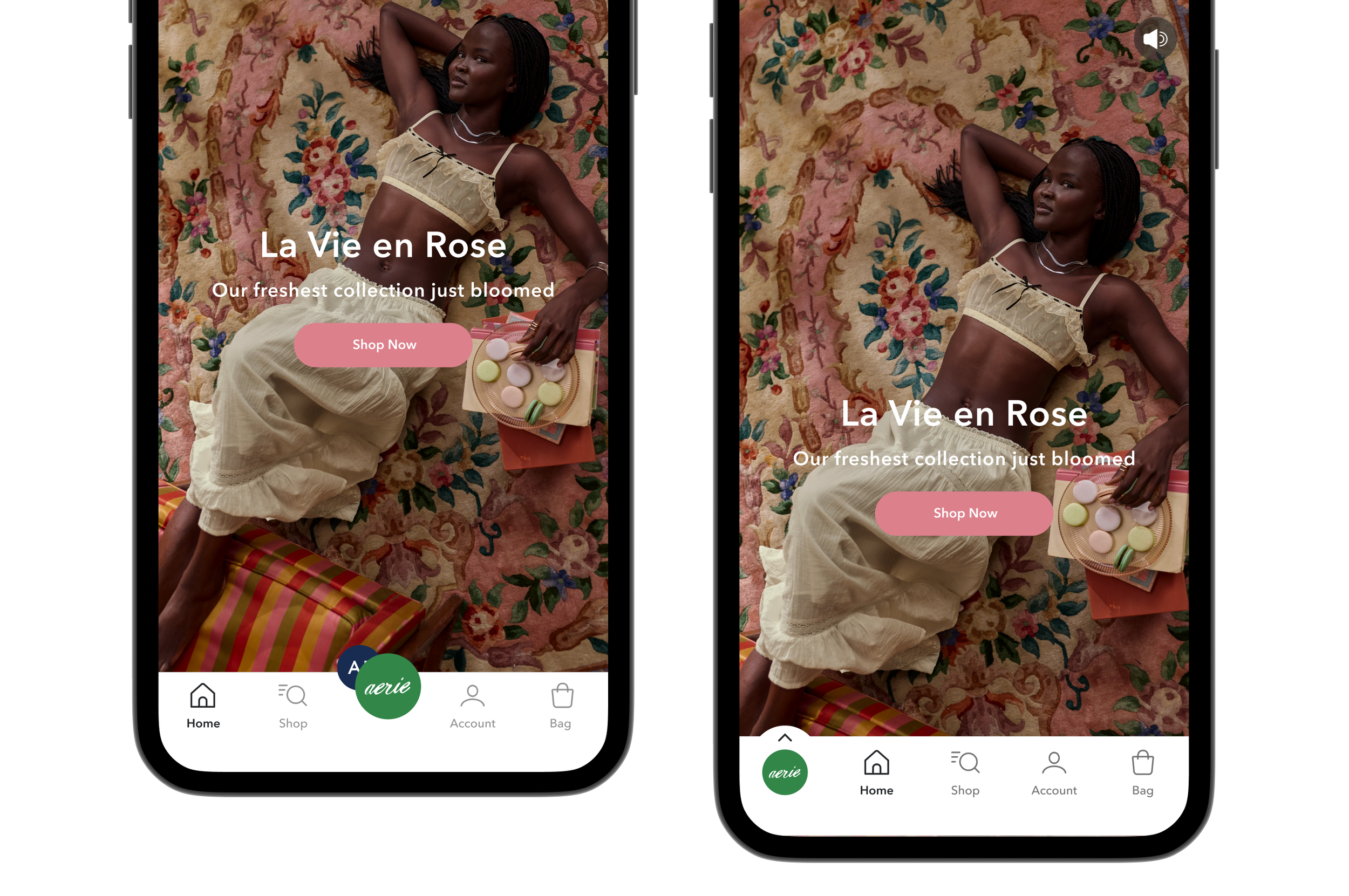
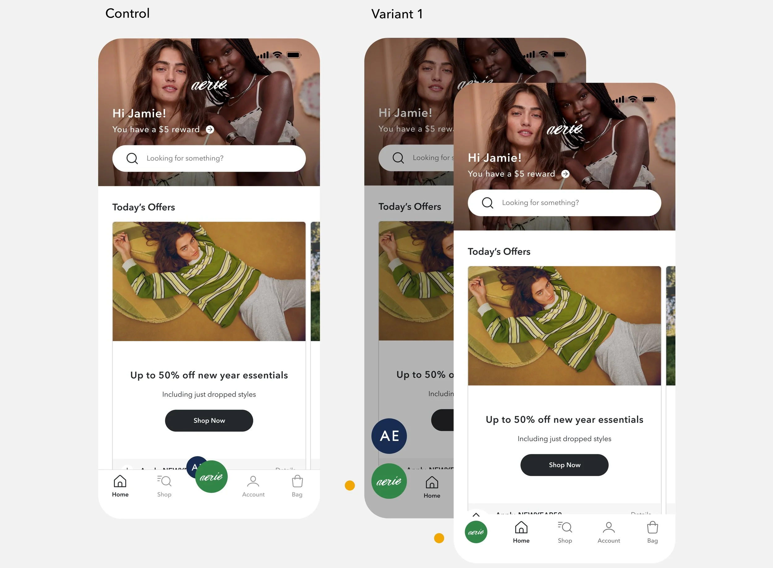
Results: The redesign (V1) was the clear winner after a 20-day test period, driving a projected $4.21M in annual revenue lift.
Design:
Consolidate promotional content under a unified "Home" tab.
Relocate "Favourites" to the "Account" tab to streamline the primary navigation.
A/B Test two variations of the "Shop" icon to optimise recognition.
Introduce text labels beneath all icons to improve clarity and navigation affordance.
Test 2: 2025
Brand-Switcher Dual Functionality
Objective: Reclaim a navigation slot for "Favourites" by merging "Home" into the brand-switcher
Primary Metrics: Conversion rate and revenue
Results: Control won after a 12-day test period. While V1 maintained cross-brand shopping levels, it created friction for returning users, negatively impacting "Home" engagement and content interaction.
Design:
Update brand switcher to not only switch brands but also brings the user to “Home”
Move favourites back to the bottom navigation bar
Test 3: 2026 - In Progress
Brand-Switcher UI Optimisation & Scalability
Objective: Redesign the brand-switcher interface to support a multi-brand architecture without disrupting current cross-brand shopping behaviour.
Primary Metrics: Conversion rate, revenue and cross-brand shopping rate.
Design:
Move brand switching to the left and exposing 1 brand icon at a time.
Design to accommodate future iOS liquid glass UI.
What did I learn?
It is ok to be conservative. When it comes to navigation, a small move has huge impact. Since all users need to engage with the navigation, even 0.01% impact to conversion measures to a huge number of lost revenue.
Plan changes in steps to help with adoption. Not overwhelming the users with multiple changes in one go was critical to the success of this re-design. Users were able to quickly adapt to small changes gradually.
What’s next?
Continue to support expansion into multiple brands. AEO has multiple lines and brands that eventually will get their own “home”. I will continue to evaluate the efficiency and discoverability when we have more than 2 brands to account for.